Advocates for Children Website Redesign
Role: Information Architecture, Wireframing, Data Analysis, User Research, Visual Design
Team: Justin Heckel, Zoe Pasternack, Delaney Reimers, Jonathan Laing
Tools: Sketch, Miro, WordPress
Advocates for Children CASA is a nonprofit organization that primarily trains and coordinates volunteers to become court appointed special advocates for abused and neglected children. I collaborated with a small team of designers to give the website an overhaul. Our client wanted to improve retention rates, receive more donations, increase the number of volunteers they get from the website, and find a way to simplify the site’s navigation. We addressed these issues by:
Compressing image files on the Home Screen so the page would load much faster
Providing a clearer and more focused narrative on the organization’s homepage
Drastically simplifying site navigation and structure
Modernizing the look of the site
The final site design greatly reduced loading times and page count so that users could experience a quicker and more focused website. With clearer messaging and calls to action, site retention rates increased and it was easier for users to volunteer and/or donate.
The Challenge
Create a new site design that increases responsiveness, navigation, and maintains interest.
As a non-profit organization, Advocates for Children relies on donations and volunteers to operate. Their goals were to increase donations, gain more volunteers, and to improve engagement through their website.
We started with website analytics. From this data we noticed that the majority of visitors used mobile devices, and that they left the home page within a few seconds after arriving. When we visited the site on mobile, we found that it took 15 seconds to load; by then most visitors left the site entirely. One key objective was already clear: significantly reduce loading times on the home page.
Increasing donations and volunteers would be a trickier challenge that focused on the users’ needs and experience with the site. To gain insight into the user base, we surveyed three key groups: current volunteers, potential volunteers, and volunteers who hadn’t finished the training program. We also conducted in-person interviews with current volunteers.
Our research goals included:
Identify how and why the users navigate the site
Establish what pain points arise during typical use
Learn what users needed to make their experience easier
We also considered the website from the view of a completely new user who might be interested in volunteering or donating to CASA, but had limited information about how to do so.
Collecting Insights
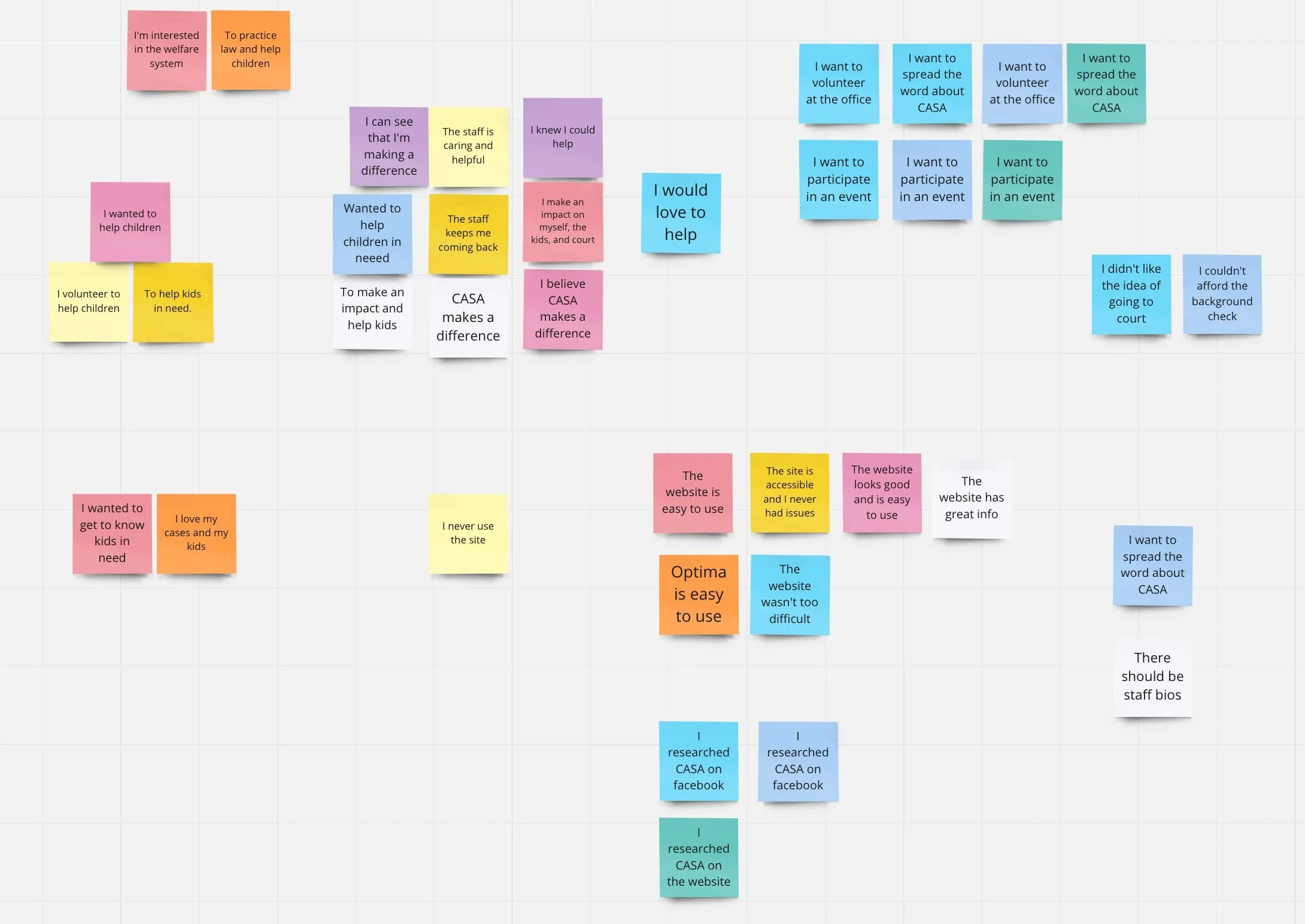
After all the data was gathered, I conducted affinity mapping to identify trends among users, what motivates users to engage with Advocates for Children, and possible pain points with the website.
From this mapping we identified the following main issues:
The website had an unusually large number of pages with bits of information scattered across them, which made the navigation experience clunky and confusing.
For the few users who made it through the long home page loading time, the purpose of the site was not immediately clear, and there were few calls to action to help guide the user. Many users left without engaging with the site any further.
A lack of clear messaging underplayed the importance of CASA’s mission.
Identifying Changes Needed
After synthesizing our data, we came to the conclusion that our website needed a few key features:
Simplified Information Architecture
A Clearly conveyed mission of the organization
Informative copy on the homepage to quickly communicate to users the importance of volunteering and donating
A Modernized look and feel
Goal 1: Simplified Information Architecture
Our first step forward was identifying what pages were necessary in the existing site and what needed reorganization. I mapped out the existing site and found that it had about 77 pages, many of which were unnecessary or could be combined with other pages. Based on site analytics, the vast majority of those pages were getting little to no traffic.
By Identifying what was necessary and reorganizing the site, I made a new site map of about 10 pages. Not only would this new structure help users navigate the site better, it would also help convey the organization’s message and improve engagement.No content was lost in the re-organization, but rather consolidated into a logical structure.
Goal 2 and 3 : A Clearly Conveyed Mission with Information On How and Why to Help
When users visited the original website, it was difficult to tell exactly what service CASA provided. There was no explanatory text on the homepage about the organization’s goal, why volunteering or donating was important, or how the process worked.
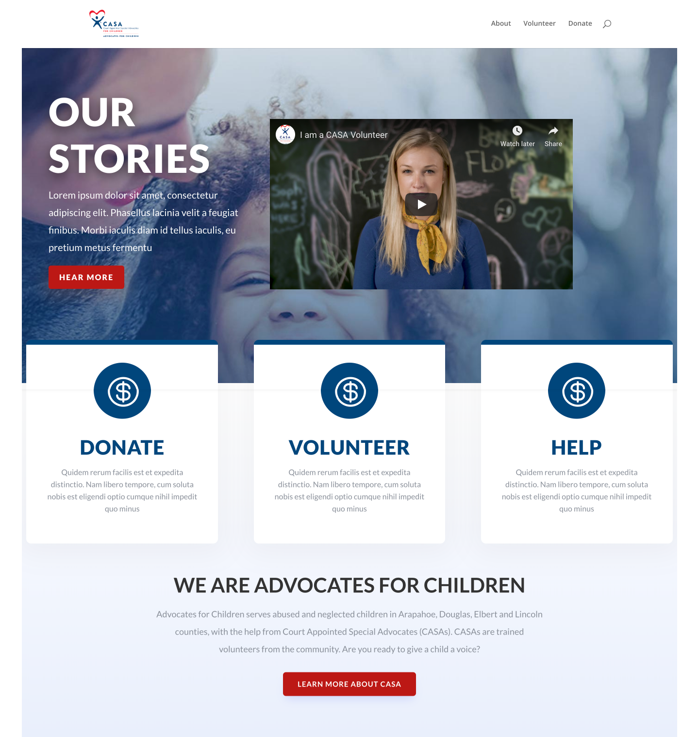
A key part of our design was to include this information with a short description of the organization on the hero image. We then made three large call-to-action cards with brief information that highlighted the importance of each action: donate, volunteer, and help. We then made it easy to learn more about the organization with a clear button. These options were also available in the navigation to allow a variety of user paths.
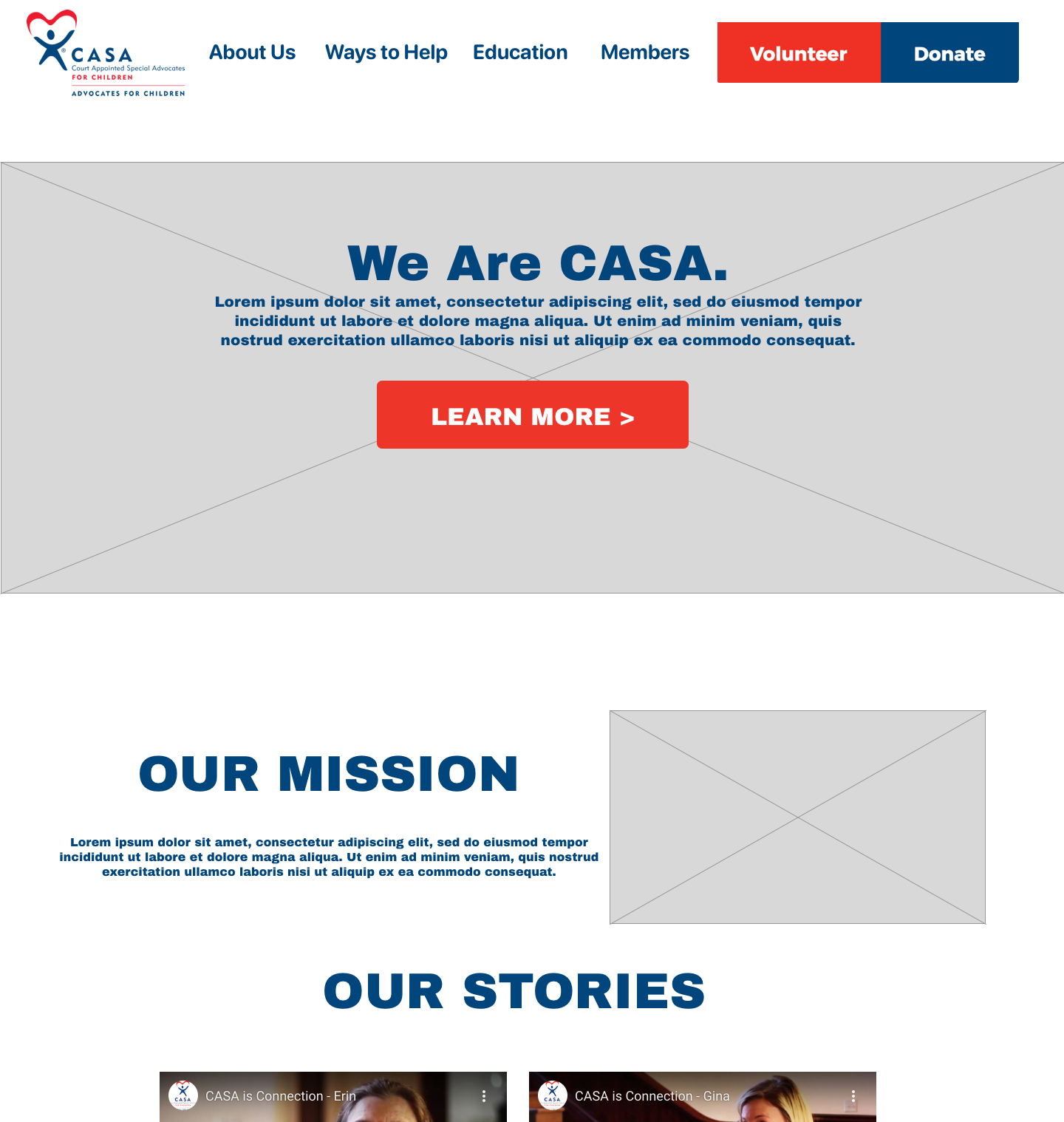
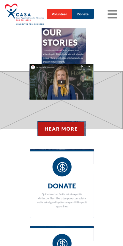
Once the page layout was determined through sketches, we built the wireframes for desktop and mobile devices.
Goal 4: Modernize the Look and Feel of the Website
The original website had a dated look, with darker colors. Most of the interior pages were blocks of text with nothing else. For our redesign, we focused on making the site feel brighter, to reflect the hope that CASA provides through its mission.
Our design included clean lines and simple geometry to be easy on the eyes. We used a limited color palette of white, red, and blue to echo the logo but not overwhelm the user. The red and blue were used to help create separation between elements and call attention to interaction opportunities. We used large, inspiring and relevant images to highlight the impact users could help create. Finally, we updated the top navigation menu to reflect the consolidated site map. The final design is a website that engages the user from the get-go and is a breeze to use.
Because Advocates for Children was using Wordpress for their previous site, we implemented the new site on the same platform so that the client could easily transition to the new design. This was especially important because as a non-profit organization, time and resources are limited.
Results
The newly implemented design is an intuitive and responsive user experience that drastically improves user retention and increases potential volunteer signups and donations. Providing the users with enough information to make confident decisions was key to improving the engagement with the site. The final design helps Advocates for Children CASA achieve its goal of helping All children dream, thrive and grow.
Implementation
Since Advocates for Children was using Wordpress for their previous site, we implemented the new site on the same platform so that the client could easily transition to the new site with no difficulty. This was especially important because as a non-profit organization, time and resources are at a premium.


