Medtronic RFID Programming Device Redesign
Optimizing Chip Production for Safer Surgeries
My Role: Lead Designer Tools: Figma, HTML, CSS, JavaScript
Medtronic is the world’s leading company in the research, design, manufacture, and sale of biomedical instruments. I led the redesign of the user interface for a machine that programs RFID chips for use in surgical instruments. The existing interface was tied to outdated hardware that was difficult to use and caused frequent production delays. Users had trouble accessing the information due to poor organization and outdated interaction methods that did not suit the mode of input. They also struggled with disconnecting servers that halted production and caused major delays. The production team needed an updated UI that would make the process easier and more efficient. I addressed these issues by:
Redesigning the interface to cater to touch input
Ensuring the information was readable at the expected viewing distance
Reorganizing the information to be easily accessible
Adding a new feature that allowed for the saving of queued data which enabled users to continue working even if the servers disconnected.
The final design helped the company save millions of dollars through reduced downtime and increased efficiency.
The Challenge
Create a new user experience that dramatically improves responsiveness, navigation, and efficiency.
The existing machines used to program ID tags for surgical instruments had outdated hardware and a cumbersome user experience. I took on the task of completely revamping the user interface to compliment the updated hardware and dramatically improve the user experience while increasing efficiency.
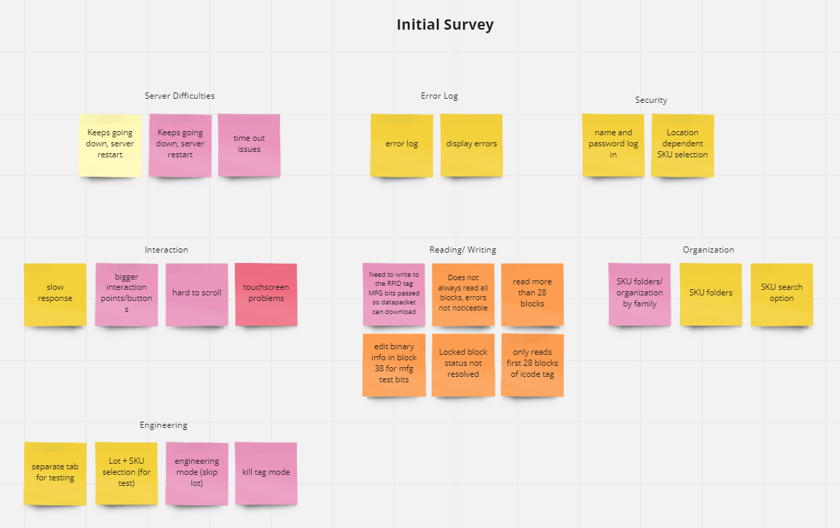
In order to address the user’s needs, I needed to learn more about the users themselves. I conducted user surveys with everyone who worked with the machines regularly, focusing on current pain points and desired changes. After my first round of user research, I found that there are two basic types of users: those on the production floor programming the RFID chips for use in final products, and engineers who regularly work with the machine for testing and troubleshooting. There was a lot of overlap in feedback between the two groups in terms of basic usability and convenience, but the engineers had many specific suggestions relating to debugging, while the production floor employees’ needs were centered on interaction usability and ease.
Analysis of the current design revealed several major pitfalls. The biggest obstacle was organizing all of the selectable options within the UI. For each product that uses RFID tags, there are dozens of SKUs and even more Lot Numbers under each SKU category to choose from. In the previous UI, every SKU was in one long list to scroll through, and then lot numbers were in another long list of selections. Users would spend a long time scrolling just to find the one number. Organizing and presenting this information presented an interesting challenge.
Another major issue was the connection with the server frequently dropping, which would stop production altogether. This caused huge delays and ultimately loss of revenue.
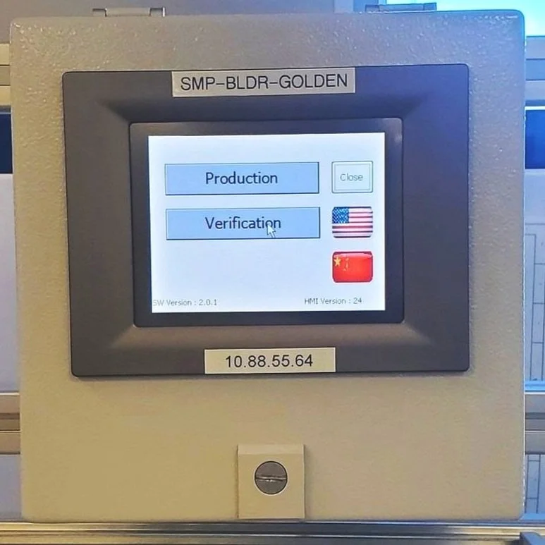
Finally, users were constantly fighting the resistive touch screen while trying to click on a list of small touch targets that seemed made for mouse interactions and not for finger presses.
Images of the original device and design. The design was clearly meant for a computer and mouse, despite using finger touch input.
From there, I identified what features were necessary, desired, and lower priority ‘nice to have’ based on my user data and discussions with the project team. The final priorities for the redesign included:
Include an easy to access error log to help identify and solve system bugs
Reorganize and group the Lot Numbers and SKUs for smoother presentation
Design for touch screen standards by increasing the size of touch targets
Add a feature that allows for queued programming data which can be
Create a feature that queues programming data even when the servers are down to prevent production disruptions
The Solution
Ideation
“We want an easier way to troubleshoot and debug.”
In the original design, the engineers had to log in to a separate admin interface to access error information on bugs. I streamlined the troubleshooting process by adding an easily accessible error log on the homescreen. This reduced the time it took to identify and resolve software errors and bugs.
“The touch targets are too small and hard to read.”
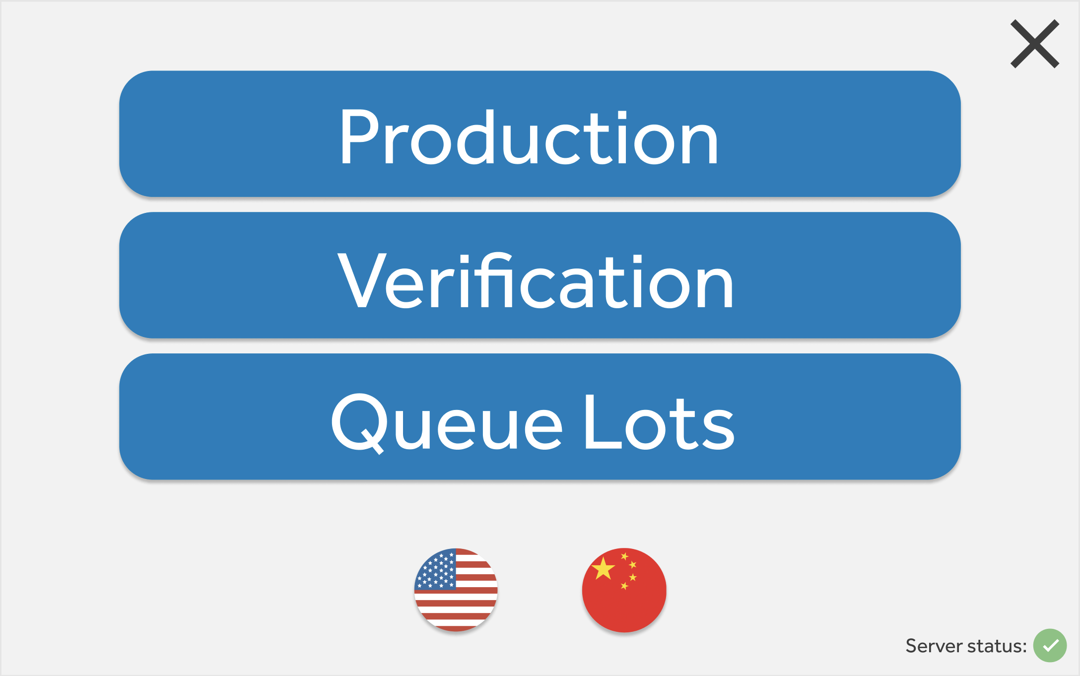
I addressed the frustration users had with trying to press small touch targets by increasing the size of each target. This also improved the readability of the screen content.
“It takes a long time to find the correct SKU Number and Lot Number.”
To create a smoother user experience, I changed the user flow for choosing each SKU and Lot number. Users originally had to scroll through an entire list to find their selections. I solved this issue by grouping SKUs into product families. The individual SKU number would be chosen from those groupings. This would prompt a follow-up screen to choose the appropriate Lot Number. While this added a step to the process, the new flow dramatically reduced the amount of scrolling time while improving efficiency and accuracy of selections.
“When the servers go down, production completely stops.”
One of the major pain points for users was that production of surgical devices halted whenever the connection to the servers was lost, which happened as often as multiple times a week. This then required key individuals to get involved in resuming production, sometimes in the middle of the night.
This was addressed by providing a new feature: queueing lots. This new feature allowed each machine to queue up Lot and SKU Numbers for future production. This allowed so production to continue even if the connection to the server was lost. This improved efficiency on the production line, reduced stress for everyone involved, and saved the company money.
Early sketches of the design helped to quickly narrow down the layout that best fit the use case.
Design and Iteration
Once the majority of responses and requests were addressed, I moved onto building the interface. I started with a basic sketch for quick initial interactions before moving on to the wireframe. Once the wireframe was approved, I designed the working prototype. Along the way some minor features were added and small issues addressed. I conducted user tests on the prototype, allowing users to provide feedback before any code was written. Based on the feedback, the navigation and layout was minorly adjusted before the final prototype was delivered.
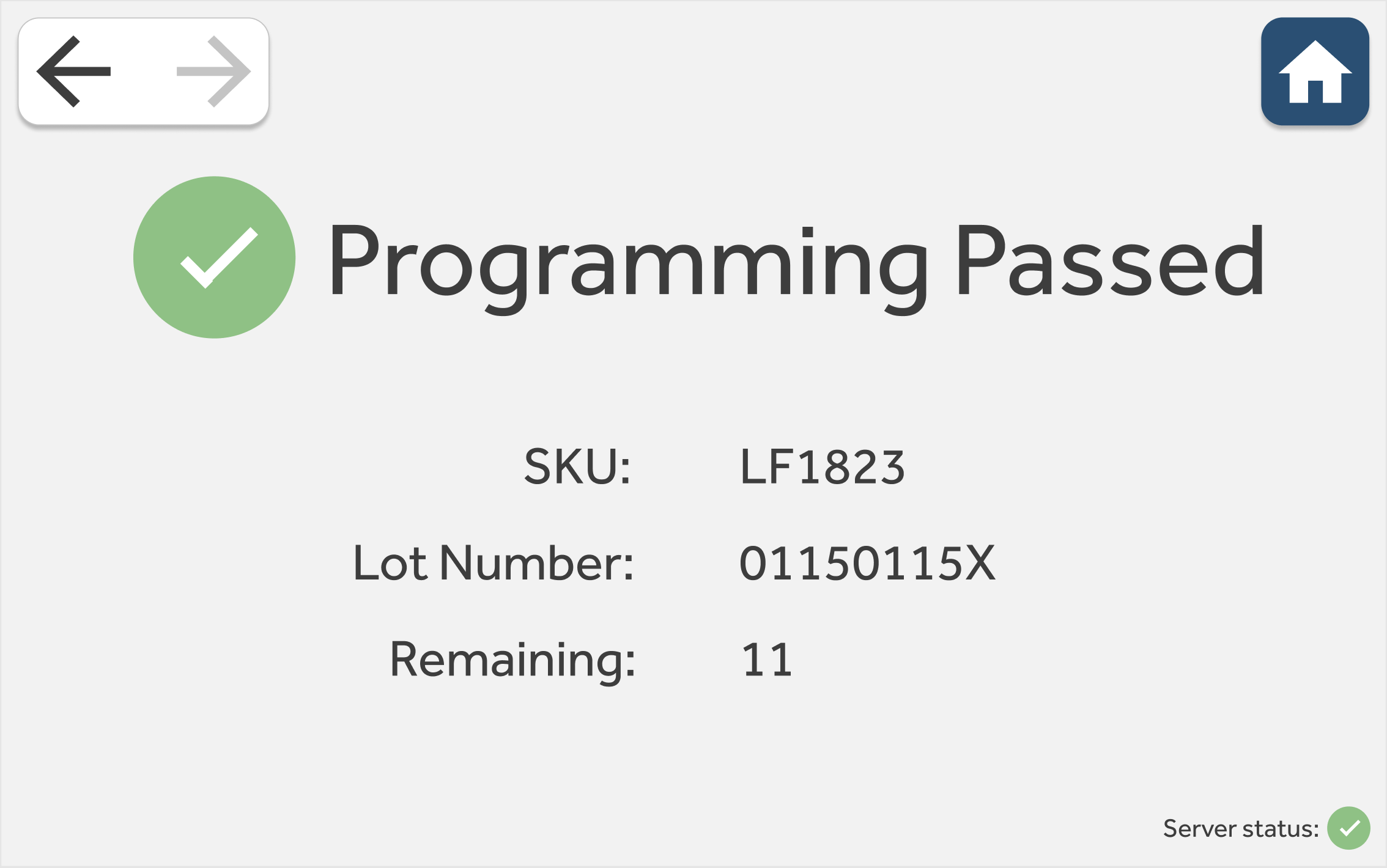
The prototype (above) saw a number of revisions as it was tested and implemented.
Result
The end result is an intuitive and responsive user experience that drastically improves efficiency and increases production profitability. Identifying the users and their needs was key to providing an easy to use interface. Selecting each lot number is far faster and the new queue lots feature saves a lot of time for everyone involved. The new Queue Lots feature saved Medtronic $7.4 million over a 6 month period by reducing downtime on the production line. The new design helps the company run smoothly even when internal issues arise and improves the workflow of every employee who uses the hardware.
The new UI running on the SMP machine during verification testing. This screen is used for selecting the SKU Family which reduces time spent scrolling through hundreds of SKU options.


